
Imagine walking into a small campus butcher shop—no fancy digital signage or interactive displays, just a simple chalkboard listing the day’s specials. That was the reality at the Meat Science Laboratory at the University of Illinois. If you wanted to see the latest offerings or place an order, you’d have to trek over in person or make a call during limited store hours. Not exactly convenient for busy students and staff.
Despite the old-school setup, the Lab offered something special: fresh, high-quality meats, including rare cuts you’d rarely find in a standard grocery aisle. It also housed staff who were passionate about cooking tips and best practices. But without a modern way to reach customers, much of this hidden gem stayed hidden.
That’s where our team came in.
Stepping into the Fray
I joined as the product designer on a three-month sprint to create a Minimum Viable Product (MVP). The mission was straightforward: modernize the Lab’s ordering process, highlight daily specials, offer a subscription plan for regular buyers, and weave in the Lab’s educational flavor—after all, it’s part of a university! We also had to align with the University of Illinois’ brand guidelines (bold orange, sleek black, and crisp typography).
Budgets were tight, the clock was ticking, and we only had a small dev team. The question was: How could we build an app quickly without breaking the bank? Answer: Adobe XD for design, thanks to free campus Creative Cloud licenses, and AngularJS for the front-end, because the team had prior experience with it.
Brewing the Recipe
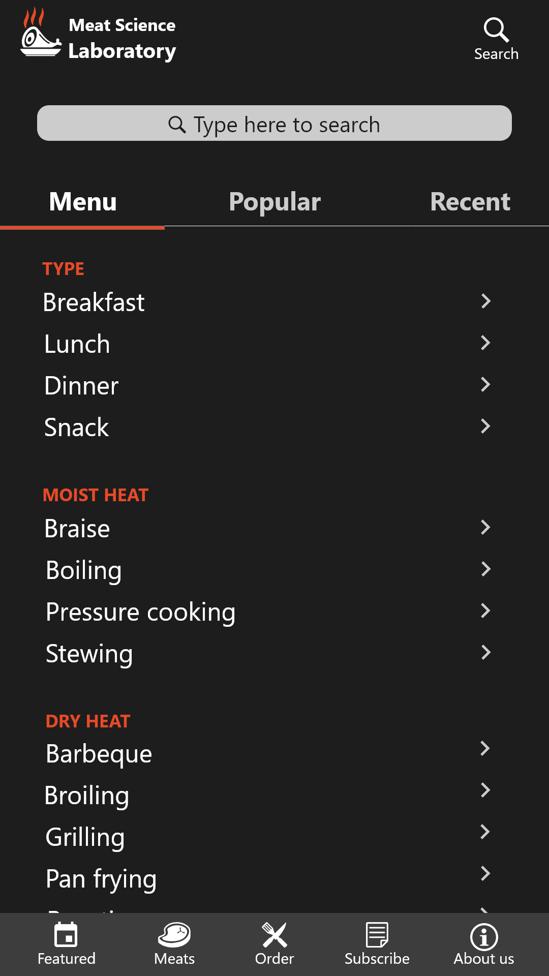
We needed more than just a digital storefront. We wanted to capture the Lab’s educational heart. So we dreamed up the following key features:
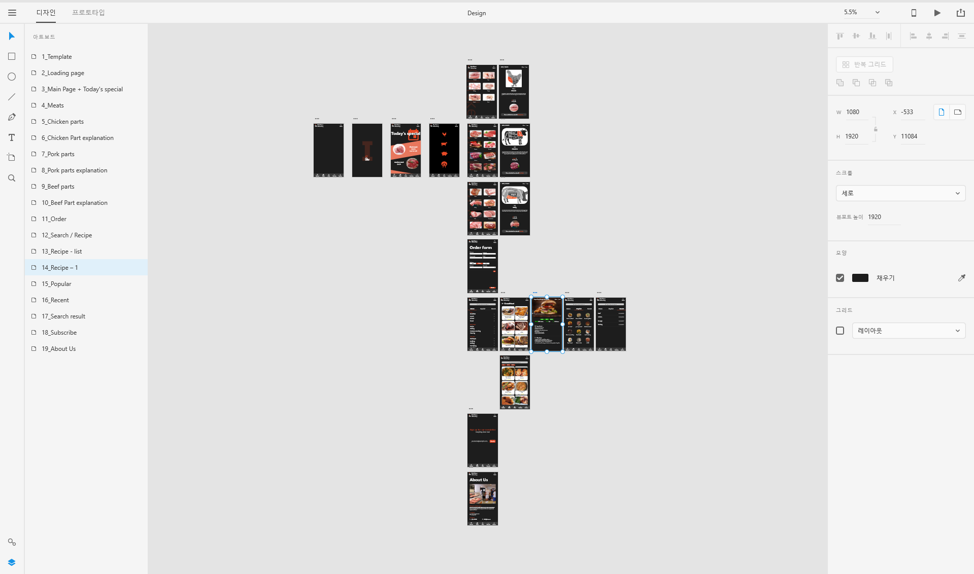
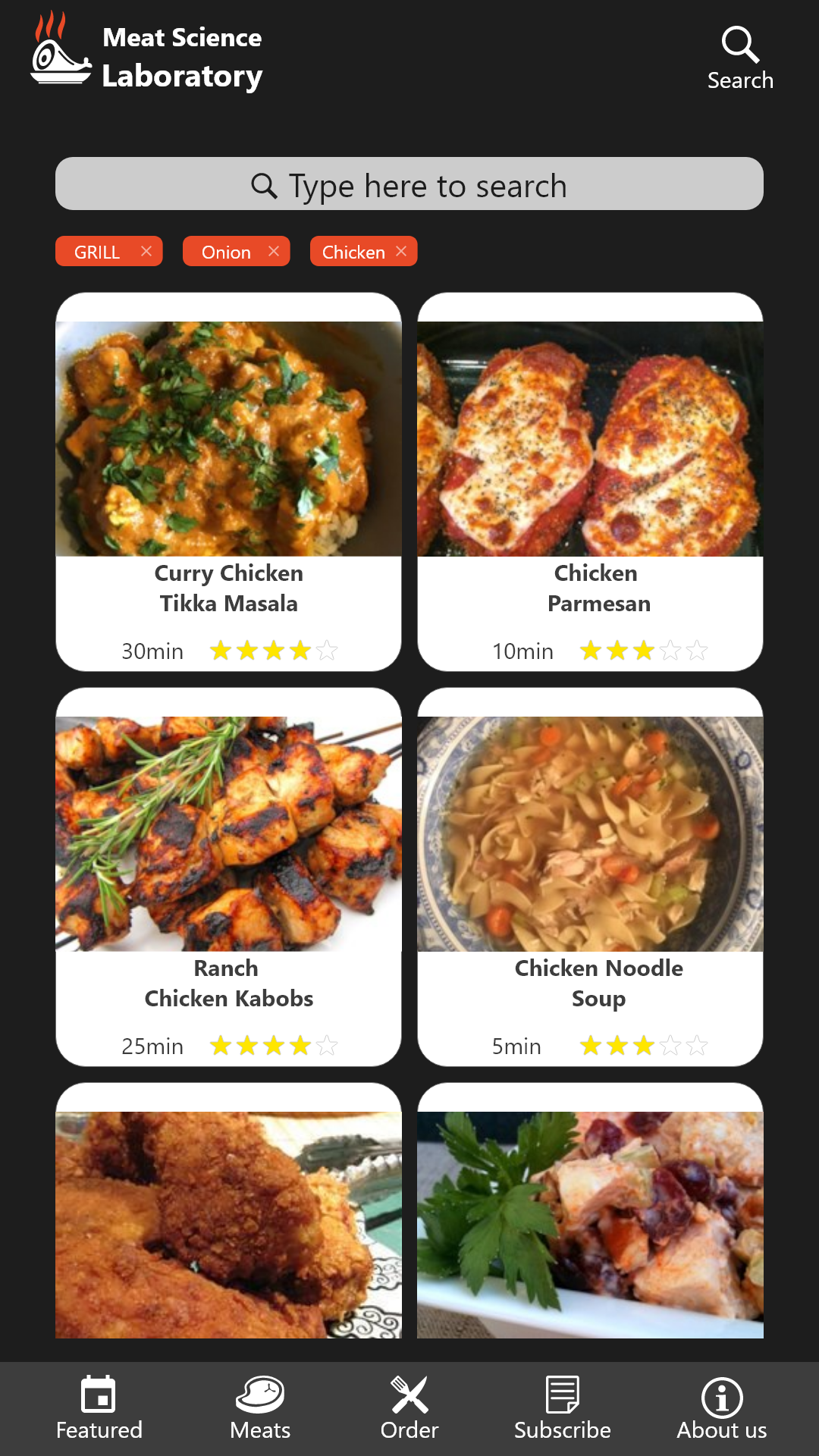
- Featured Meat: A bold banner for daily or weekly specials.
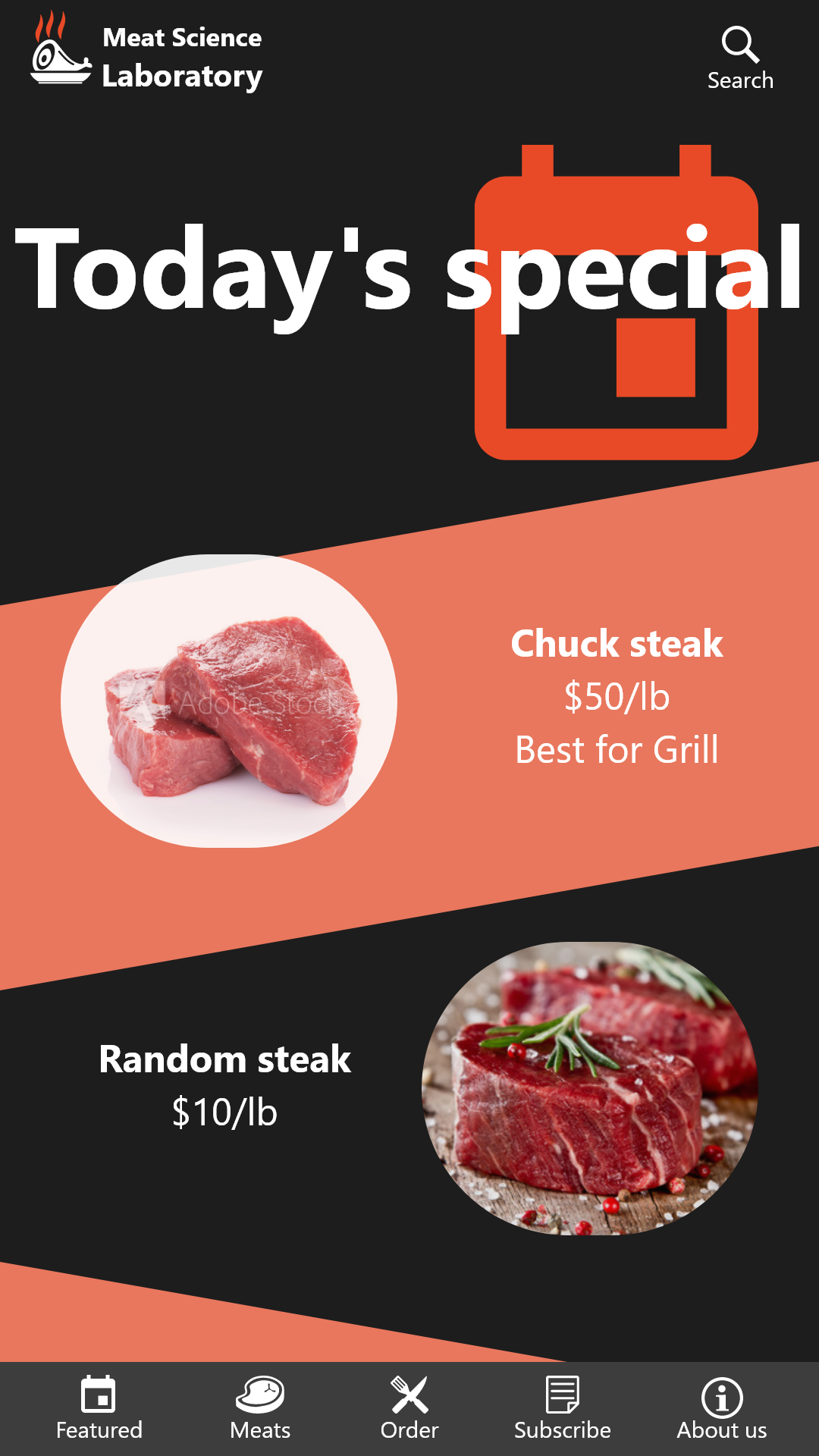
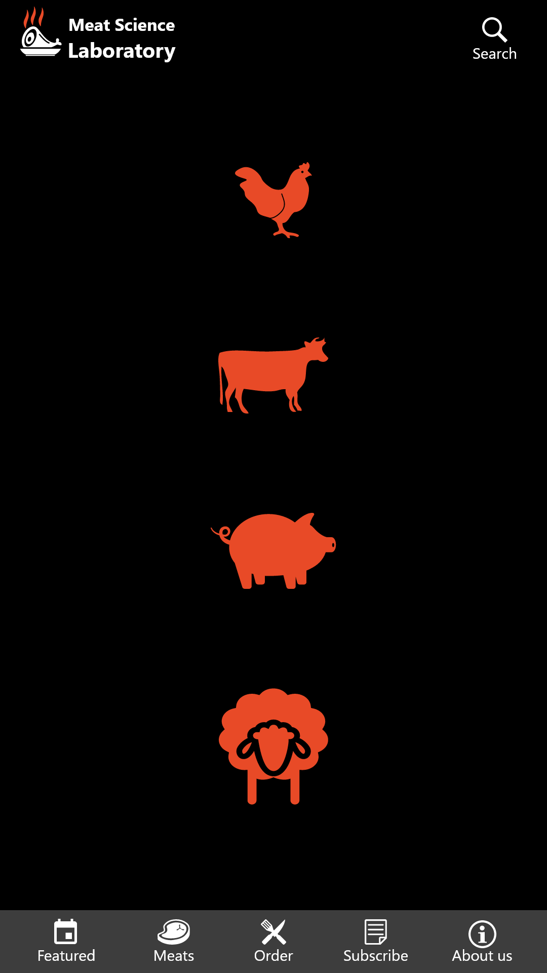
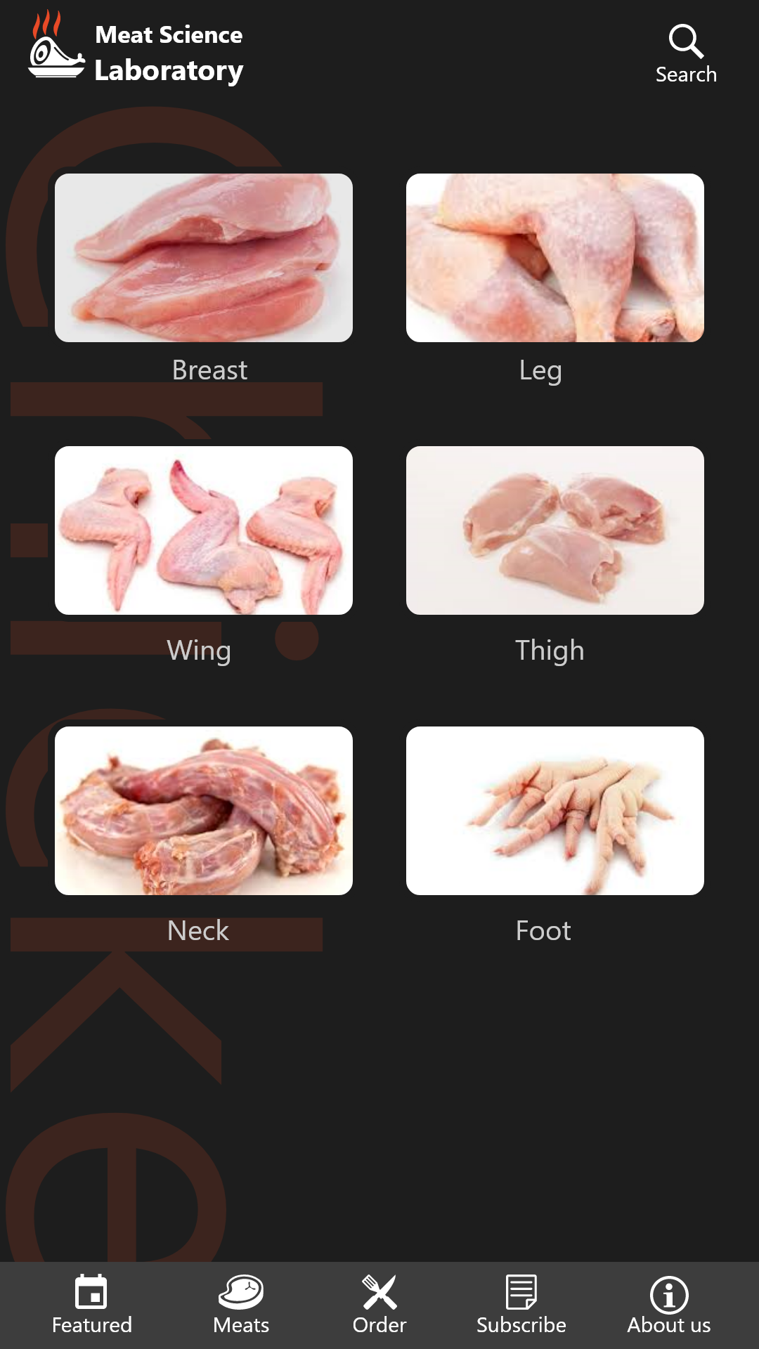
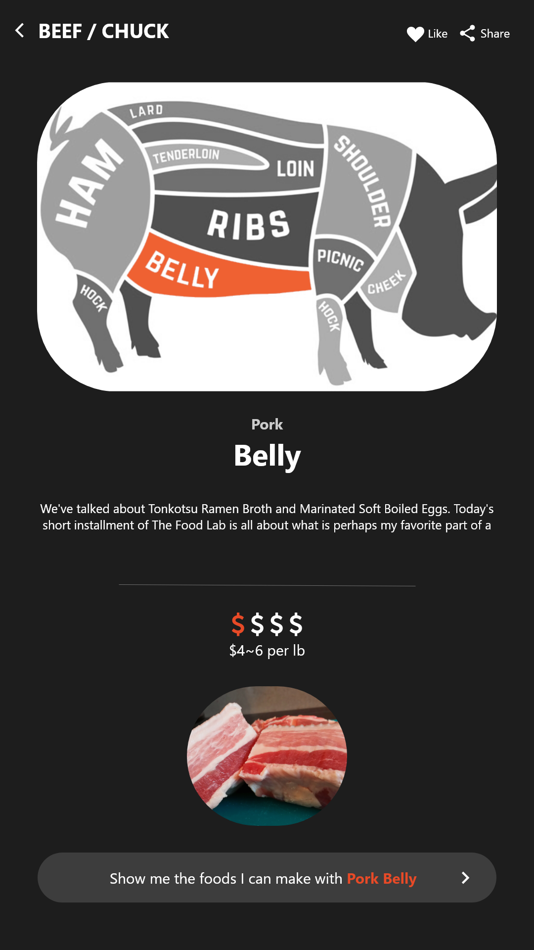
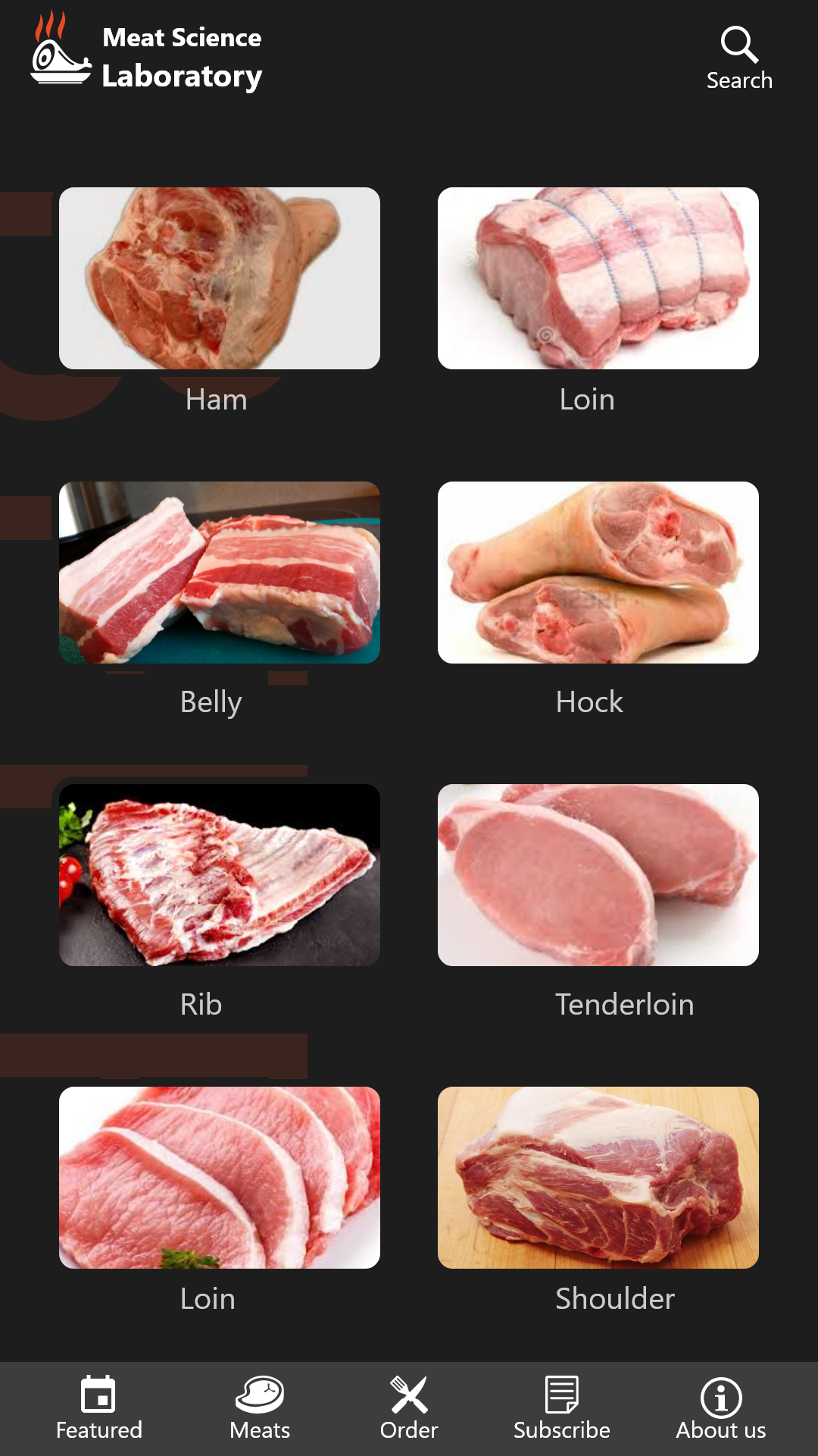
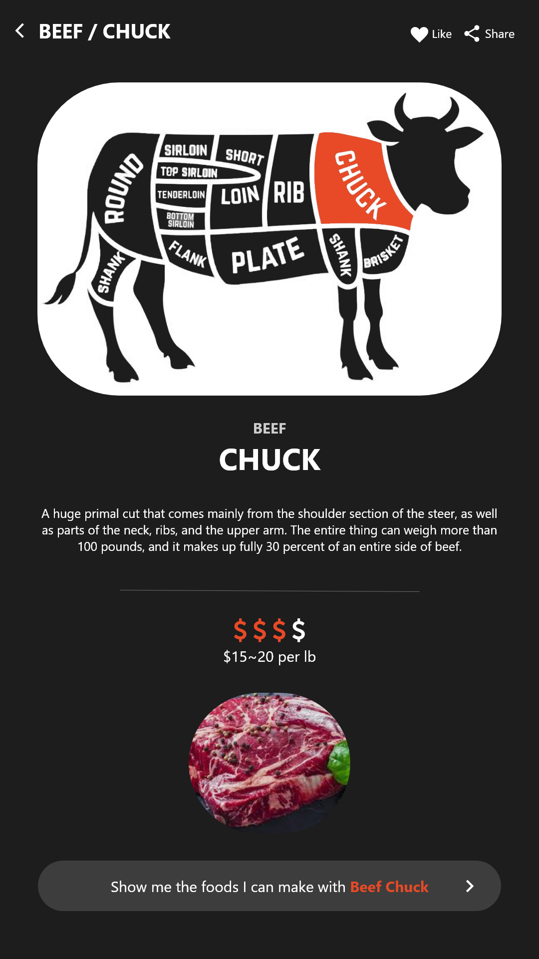
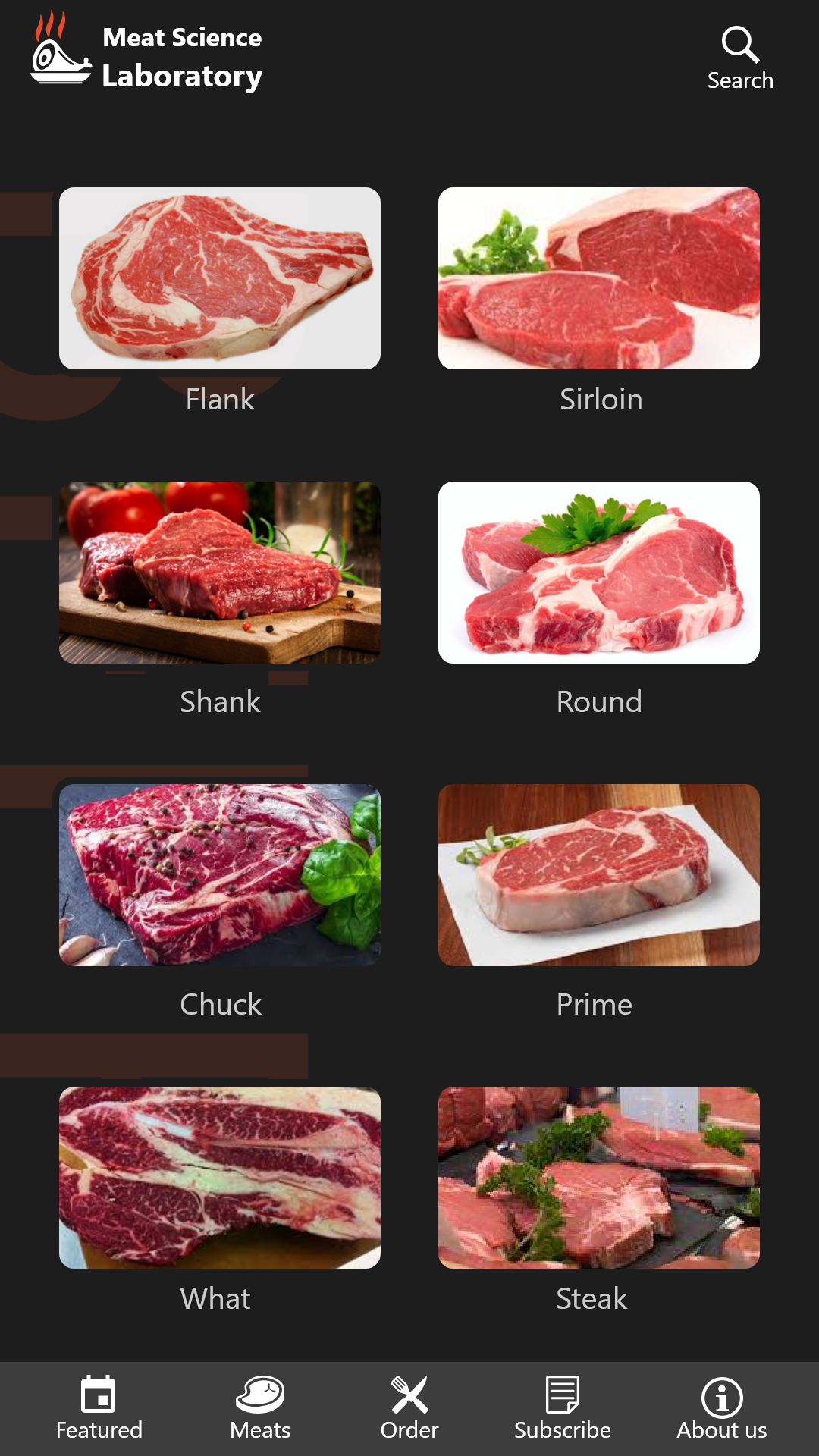
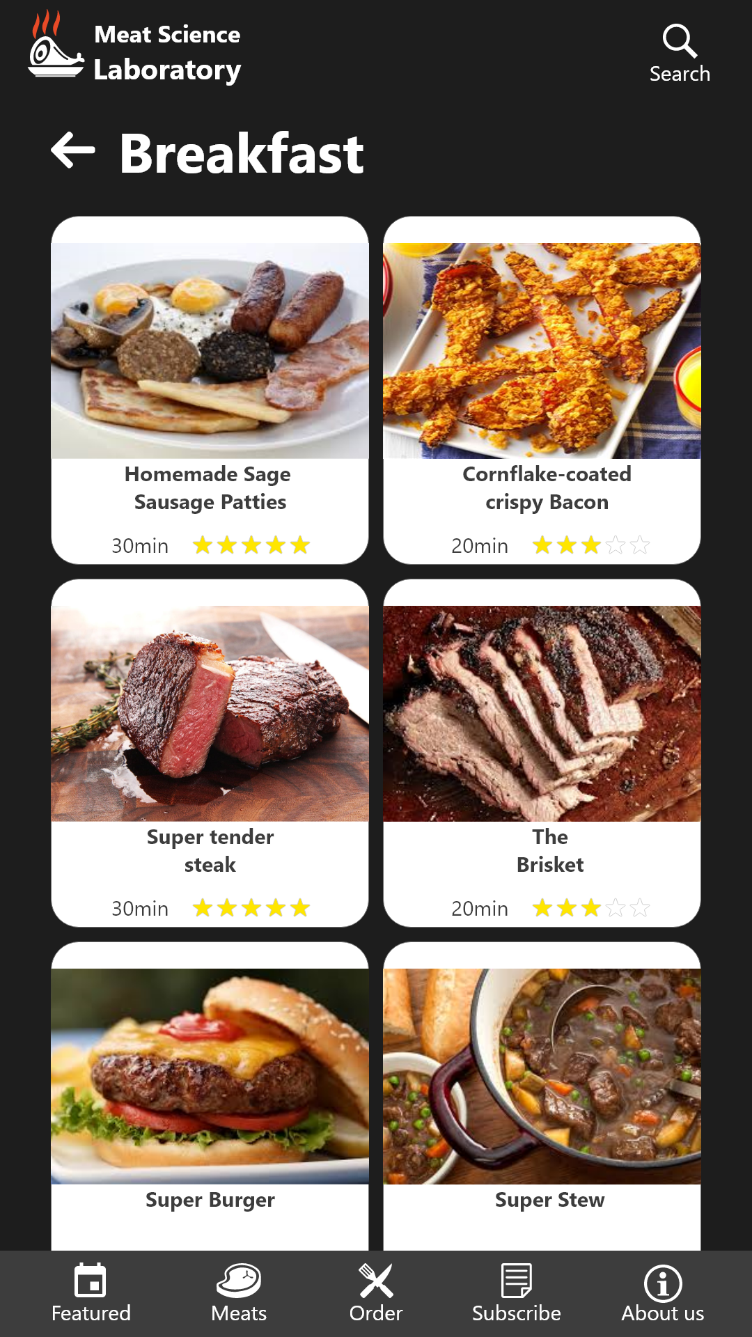
- Meat Lists: Organized by categories like Beef, Chicken, and Pork, each with pictures and brief descriptions.
- Order System: Simple forms to select a meat type, specify a cut, and input contact details.
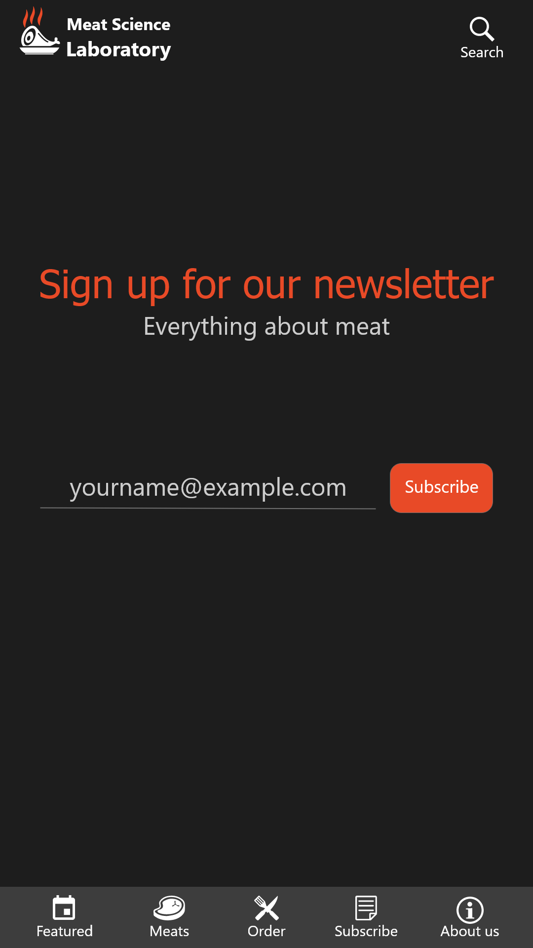
- Subscription Service: A monthly or quarterly box of curated meats for loyal fans.
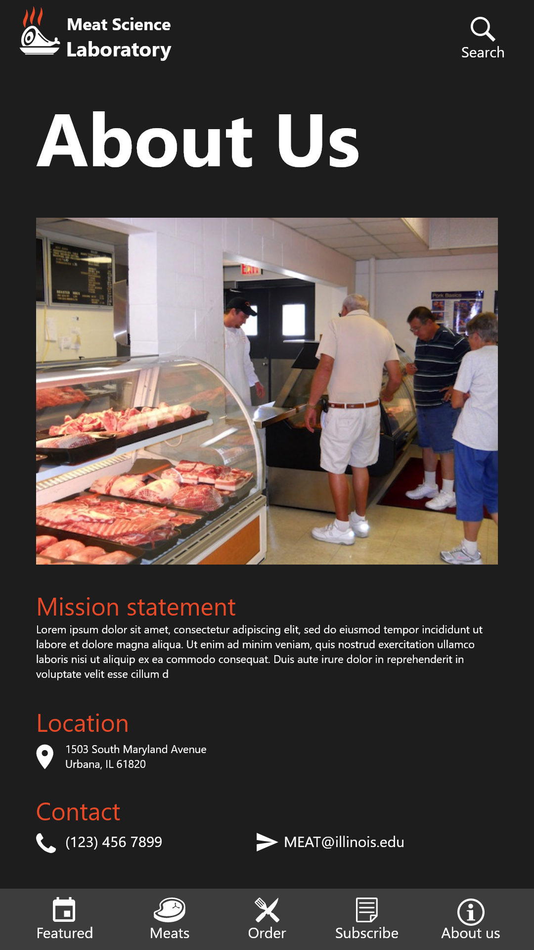
- About Us: Sharing the Lab’s story, mission, location, and contact info.
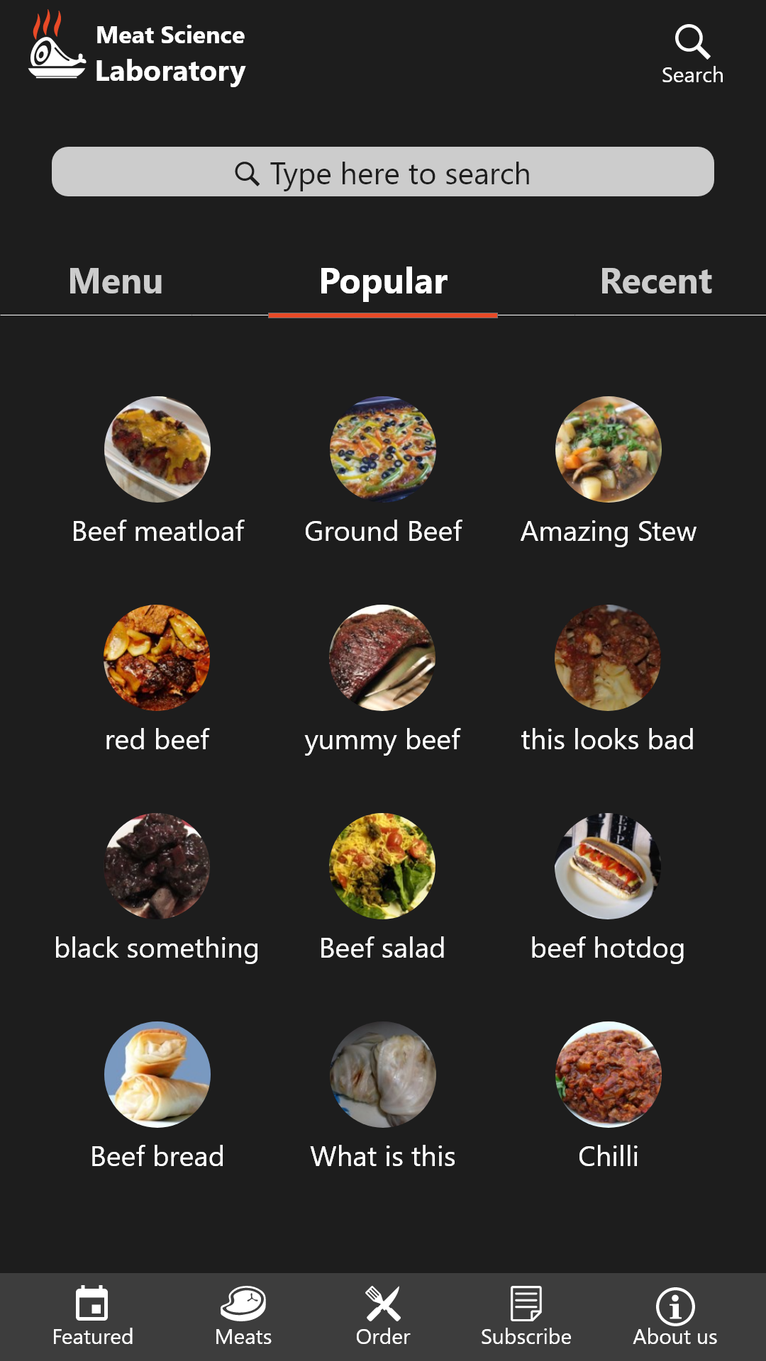
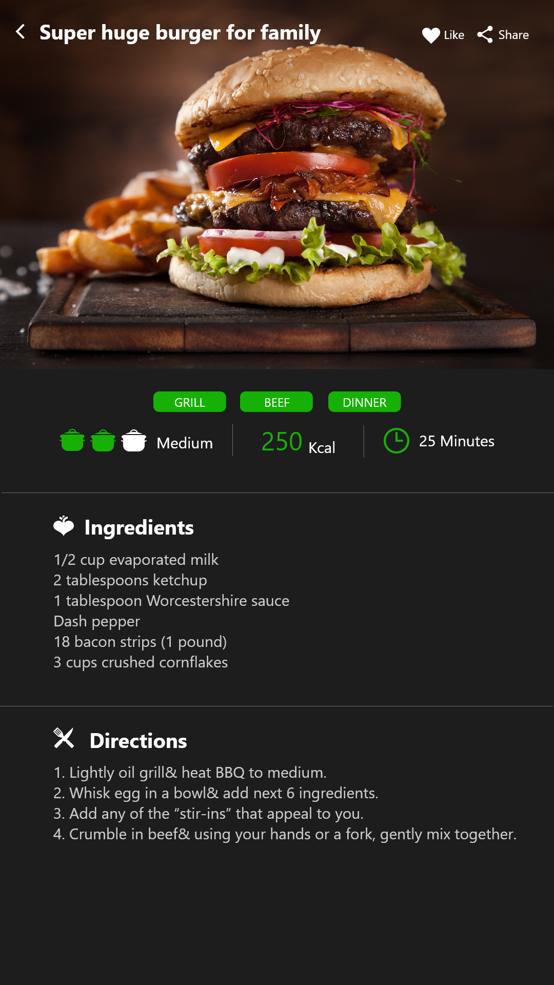
- Recipe Recommendations: A sweet bonus where users could see what meals pair best with each cut—think suggested dishes, cooking methods, and even quick tips (like “Grill Chuck Steak for best flavor” or “Try braising the pork shoulder”).
I started sketching in Adobe XD—just grayscale placeholders to finalize the layout. Once we confirmed the structure, I applied the University’s color scheme. Black backgrounds made the meat photos pop, orange accents guided the eye, and white text created a clean contrast.
Within each meat category, we included a button (or a small callout) saying something like, “Show me dishes I can cook with Chicken Breast.” This was a critical addition because many first-time buyers have no clue how to maximize certain cuts. We wanted them to tap or click once and land on a list of possible recipes—from simple grilled chicken to elaborate stir-fry, with short instructions to get them started.
On the dev side, AngularJS became our go-to. Our timeline was too tight to experiment with a new framework, and AngularJS gave us a structured approach we could set up quickly. It may not have had the flair of React or Vue, but it fit our immediate needs.
Taste Test and Adjustments
We put together a clickable prototype in XD and asked a handful of students and staff to test it:
- Could they find the day’s special right away?
- Was it easy to browse meats by category and discover cooking tips?
- Did the order form feel straightforward?
The feedback was lively:
- “I love the cooking tips! Wish there were even more recipes.”
- “The order form is super simple—just enough fields to feel confident about my order.”
- “Can you make the subscription section more prominent?”
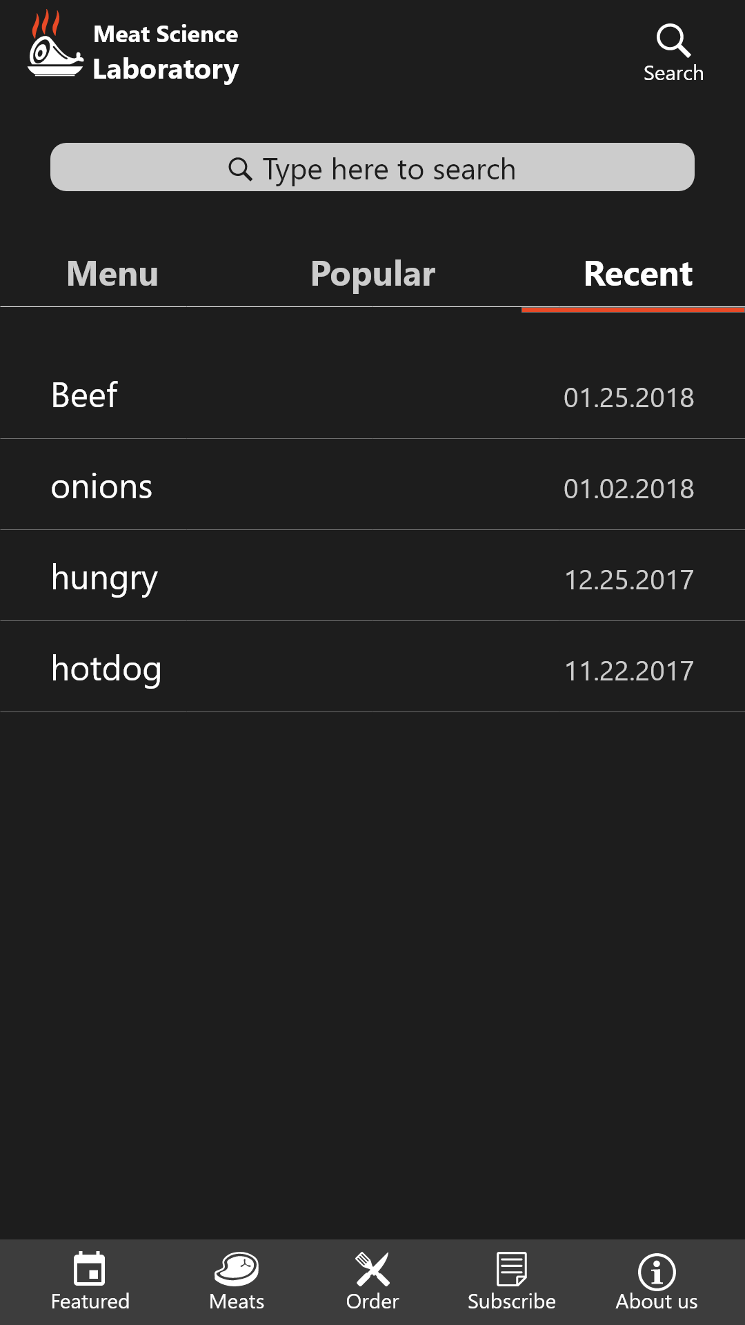
We tweaked everything based on these comments. We also updated the color saturation so that the orange popped more on smaller phone screens. Adding a search bar in the recipe section made it easier to find specific meals, like “burger,” “beef stew,” or “chicken curry.”
The Grand Reveal (Sort Of)
After three months, we had a functional MVP that ticked all the major boxes:
- Modern Layout: Crisp visuals, intuitive navigation, and a color palette that matched the university’s brand identity.
- Recipe Integration: Each meat cut had suggestions for what you could cook—a simple but powerful way to inspire customers.
- Order & Subscription: A no-fuss form that captured essential details. The subscription tab let people sign up for regular deliveries (in concept, at least).
It felt exciting to hold the prototype in our hands. We could see how this small campus butcher shop could evolve into a more accessible, interactive experience. Users appreciated the idea of checking the day’s special and scanning potential recipes during a lunch break, without stepping foot in the Lab.
Yet, despite the promising feedback, the project never fully rolled out to production. Interest at the management level waned; perhaps they didn’t see the immediate ROI, or maybe resources were too limited to maintain a new digital product.

Lessons from the Kitchen
- Secure Leadership Buy-In Early: Without consistent support, even the best designs can stall.
- Test with Real Users ASAP: Our quick prototypes yielded precious insights. Starting that process even sooner would have been beneficial.
- Highlight Value Through Stories: Customers loved the recipe suggestions, which directly solved their “How do I cook this?” dilemma. Leaning more into that narrative might have enticed more sign-offs from stakeholders.
- Keep an Eye on the Future: If we had successfully integrated payments, user analytics, and more robust subscription management, the MVP might have won extra momentum.
In the end, we took an antiquated chalkboard system and turned it into a sleek mobile experience—complete with bold visuals, easy ordering, and cooking inspiration. Even though it didn’t go live, the MVP sparked ideas about how technology could revolutionize not just this Lab, but any specialized shop struggling to reach modern consumers.
That’s the real takeaway: Sometimes all it takes is one interactive prototype, one set of inspiring user flows, to show what’s possible. And even if your brilliant idea doesn’t make it past the MVP stage, the lessons learned can shape the next project—or help future innovators pick up where you left off.


