
Chapter 3: Designing for Decision-Making — From Prediction to Impact with Power BI
Once our machine learning models were consistently predicting student retention risk with high confidence, the next challenge wasn’t technical. It was human.
We had powerful insights. But how would they reach the people who could use them—the advisors, career coaches, and mentors in the Life Design team?
If the data stayed in a Python notebook or a spreadsheet, it wouldn’t matter. To make an impact, we had to translate our work into something that fit seamlessly into the daily decision-making process of real humans working with real students.
This is the story of how we turned our machine learning predictions into visual, interactive tools using Microsoft Power BI, and what happened when we put those tools in the hands of people who cared deeply about student success.
Why Power BI?
BGSU already used Power BI across departments, which meant advisors were familiar with it. That mattered. We didn’t want to train users on a whole new system. Power BI offered the best combination of:
- Enterprise integration (SharePoint, Teams, Azure)
- Interactive filtering and drilling
- Scheduled refreshes for always up-to-date data
- Fine-grained user access control
But more than the technical benefits, Power BI allowed us to design with empathy. We weren’t just building charts. We were building a daily workspace for advisors, who needed clarity, not clutter.
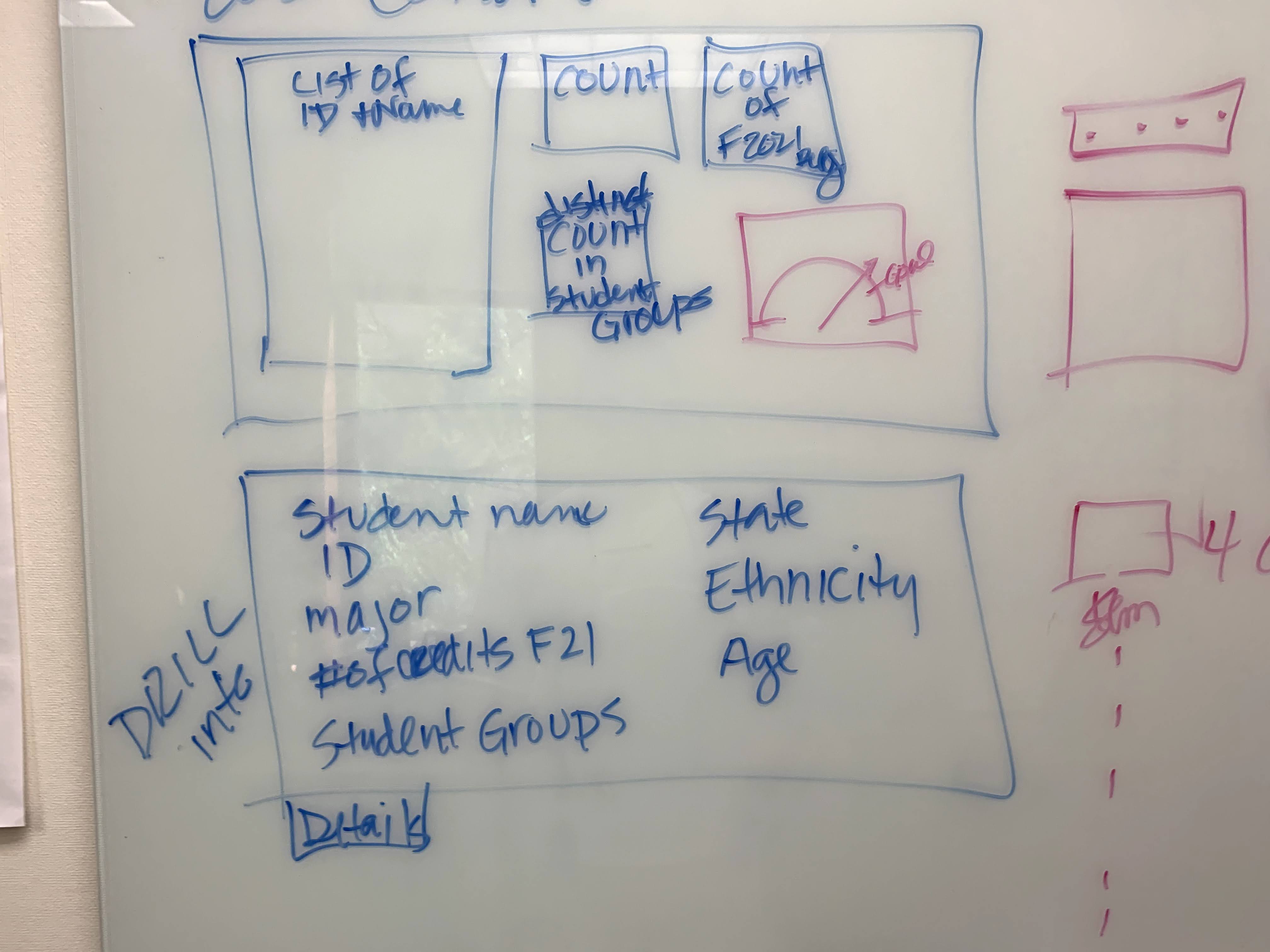
Designing for Use, Not Just Beauty
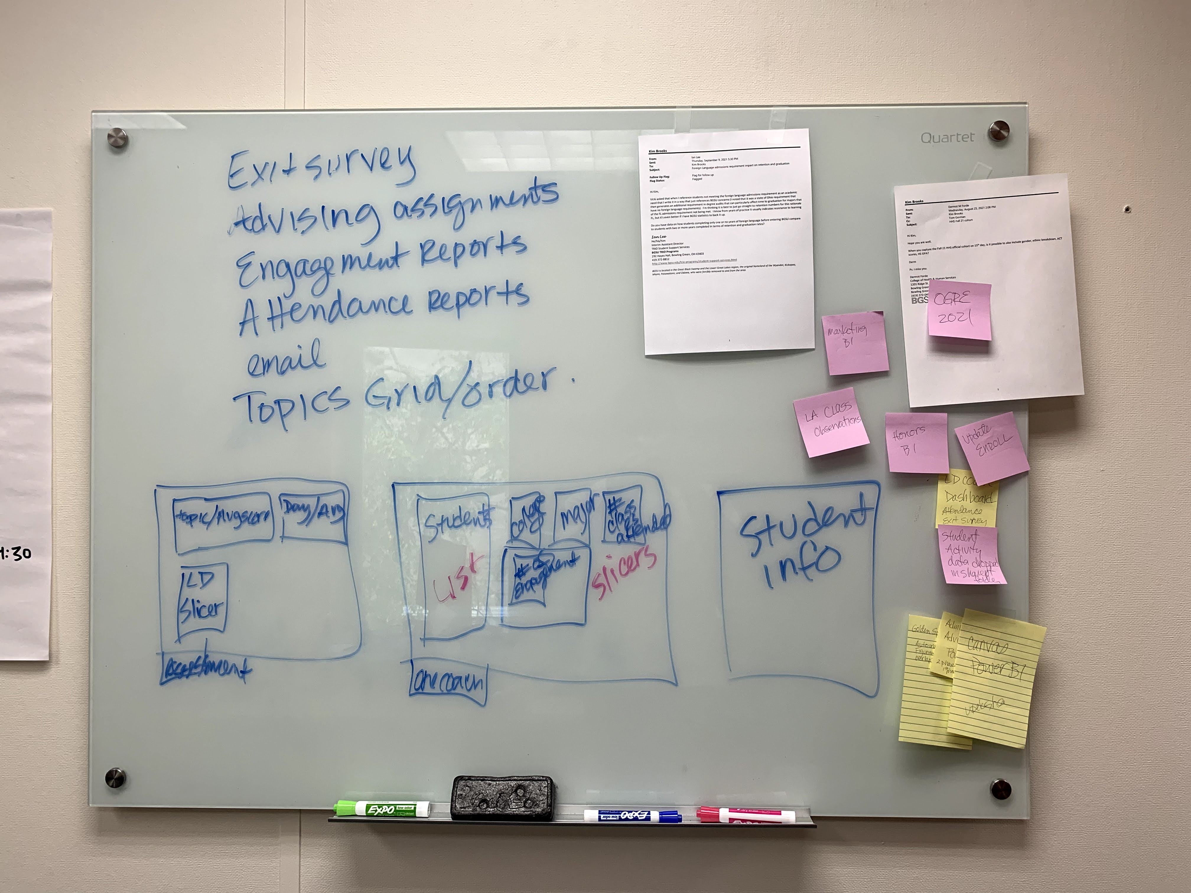
We started by asking a simple question: What does an advisor actually need to see in order to take action?
We sat in on advising sessions. We listened. And we learned that advisors didn’t want to be data scientists. They wanted answers to questions like:
- “Which students haven’t engaged with anything this month?”
- “Are there patterns I’m missing across the students I support?”
- “How do I prioritize my outreach when I have 200+ students on my list?”
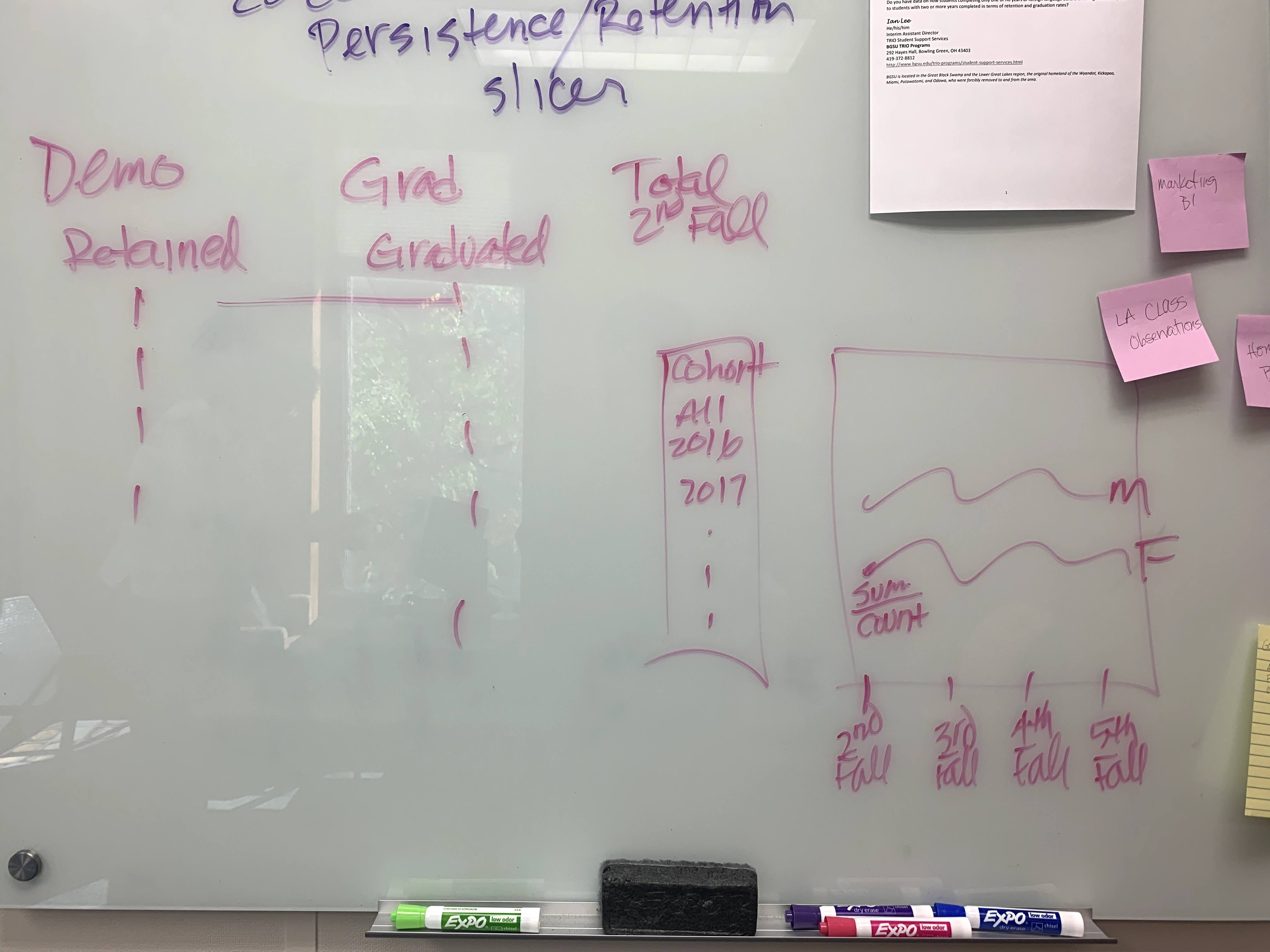
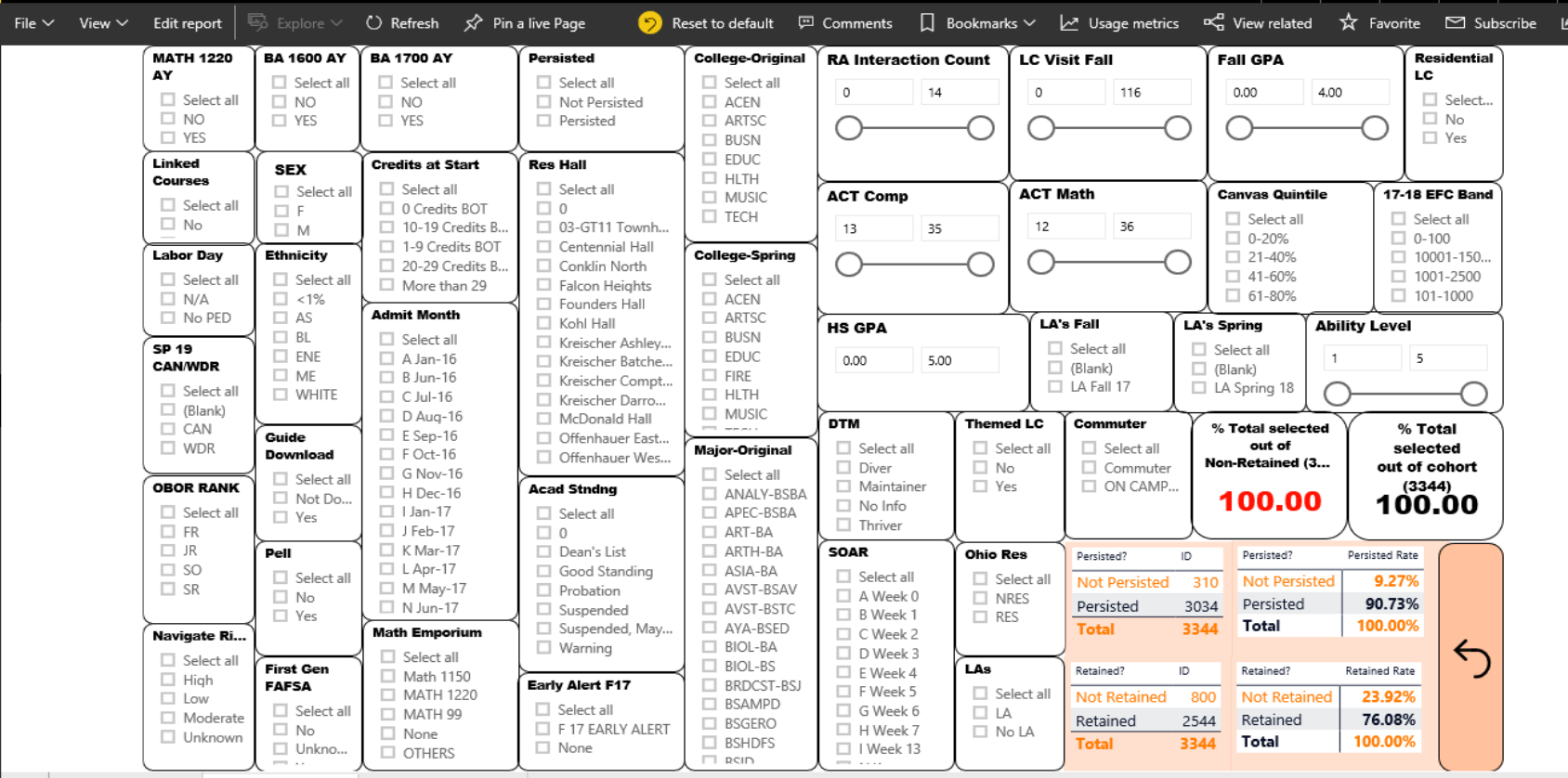
With that in mind, we designed the dashboards to answer three key use cases:
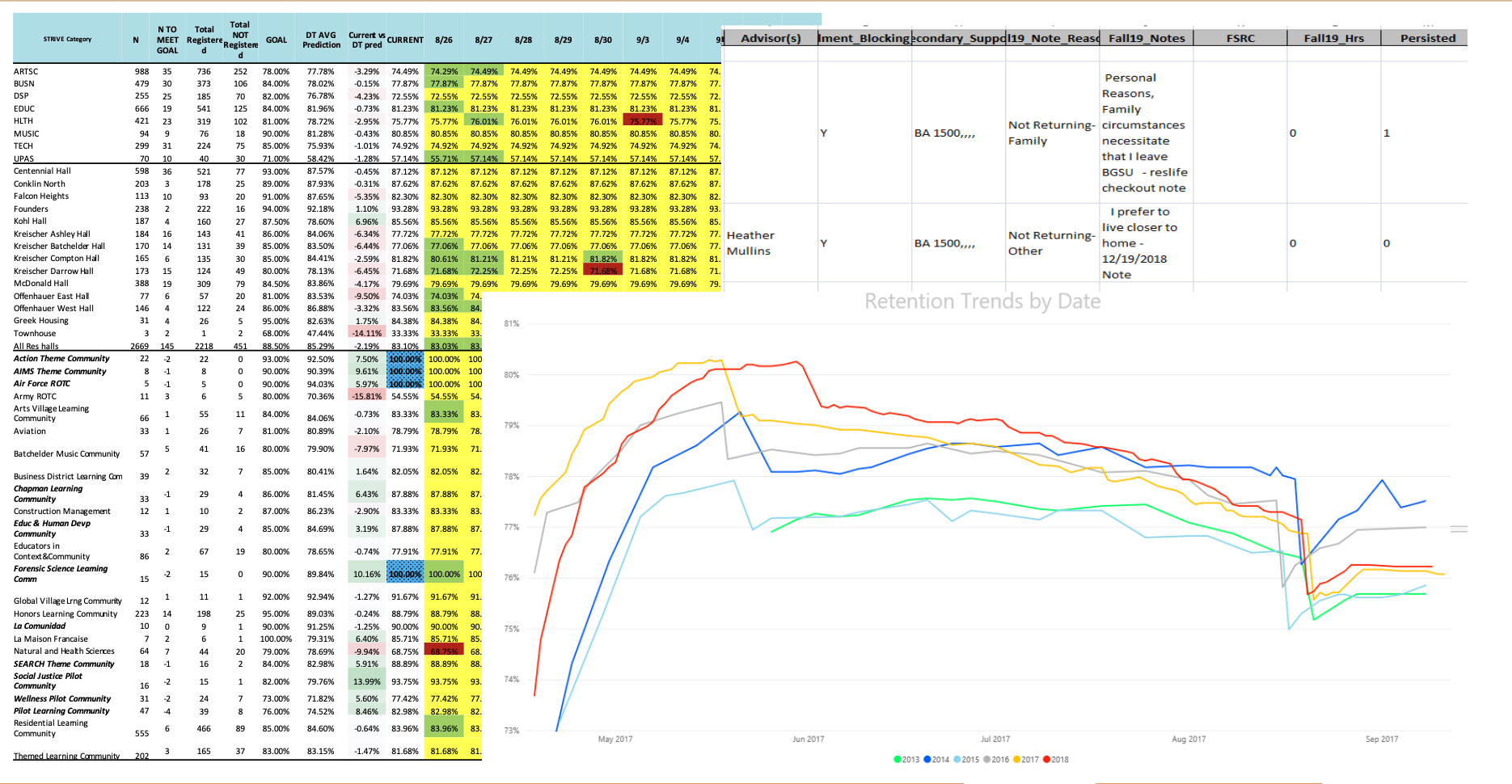
- Cohort Overview – High-level trends in engagement, GPA, and retention risk.
- Student Watchlist – A filterable table of at-risk students with detailed context.
- Student Profile Deep Dive – A one-pager view for each individual student, combining historical data, predicted risk, and behavioral flags.
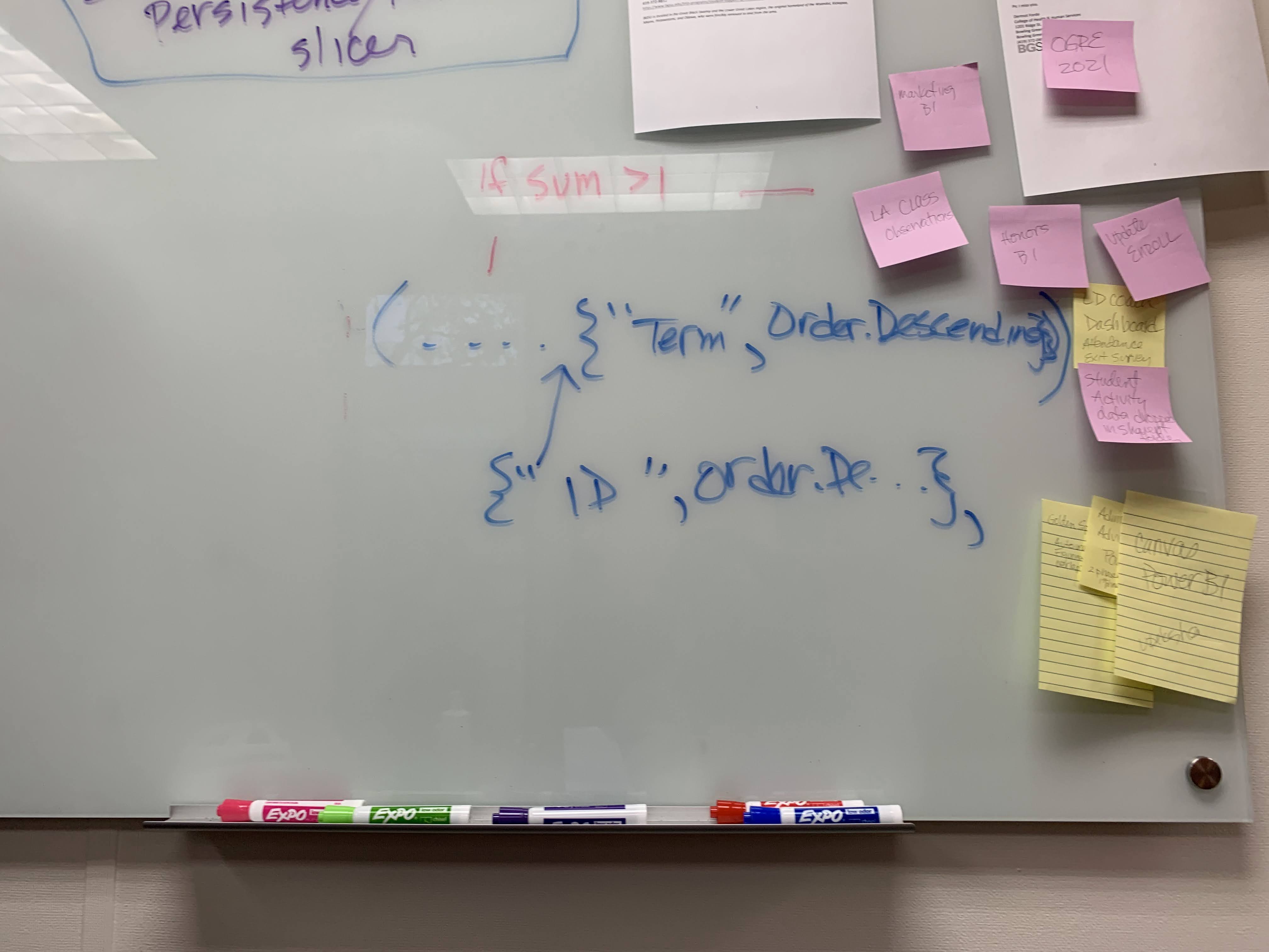
We chose simple visuals: heatmaps for risk levels, line graphs for GPA trends, and bar charts for engagement metrics. Filters allowed advisors to slice the data by major, advisor assignment, student classification, or even involvement type.
Connecting to the Broader Life Design System
What made this project unique was that we weren’t just surfacing risk—we were surfacing it within the framework of Life Design.
Life Design at BGSU is a proactive, holistic support model. Students begin with the Geoffrey H. Radbill Center for College and Life Design, and later connect to the Michael and Sara Kuhlin Hub for Career Design. At each stage, they’re guided to explore purpose, plan their journey, and build networks that support success.
The dashboard became a tool to enhance those conversations.
Imagine this: An advisor meets a student for a mid-semester check-in. They pull up the dashboard, glance at the student’s engagement timeline, see a sharp drop in participation since week 6, and gently ask, “What’s been feeling different lately?” The data doesn’t replace intuition—it supports it. It gives advisors a signal to listen more closely.
We built the tool so it didn’t feel cold or mechanical. It felt like a guide, helping human relationships form earlier and more meaningfully.
Feedback and Impact
Once the dashboards were live, the reaction from advisors was immediate. For the first time, they had a consolidated, real-time view of the students they supported. No more piecing together data from three platforms and a PDF report. Everything was in one place.
Some of the things we heard:
“I didn’t know [Student X] had missed that many events this semester. I just emailed them.”
“This risk flag caught my attention—I reached out, and it turns out they were feeling lost after changing majors.”
“It’s so helpful to see why the student was flagged. That context changes how I talk to them.”
Over time, we saw the dashboards become embedded into weekly advising routines. Some teams even used them during group meetings to review cohort trends and coordinate outreach.
On the institutional level, the insight flowed upward. The Provost’s office received regular summary reports that highlighted patterns by college, demographics, and engagement level—informing policy and funding decisions.
What Worked—and What Didn’t
What worked:
- Embedding the dashboards into existing platforms and workflows (Teams, SharePoint)
- Making the insights simple, contextual, and actionable
- Building trust through transparency and feedback loops
What didn’t:
- Some early designs were too complex—trying to show everything at once
- Not every department was ready for regular data-driven advising
- We still had to manually coordinate refreshes and data quality reviews
What I’d do differently:
- Involve advisors even earlier in dashboard prototyping
- Add annotations and “explainers” directly into the dashboard
- Pilot a student-facing view, giving students their own momentum score and insights
Final Reflections
This chapter of the project—the dashboarding, the real-world connection—is where it all came together. The automation, the modeling, the meetings, the long nights of debugging—it only mattered because someone on the other side could use it to reach out to a student and make a difference.
This wasn’t about proving that machine learning works in education. It was about proving that data, when handled with care and design, can support human intuition, empathy, and support systems.
We didn’t just predict who might leave.
We helped people stay.
Thanks for reading. If you're working on something similar, I’d love to chat. Drop a comment, send a message, or reach out—these problems are big, but solvable, and the impact is real.


