
Chapter 2: Predictive Analysis with Machine Learning
Once our data pipeline was automated and stable, we reached the pivotal part of the project: turning that data into insight.
We didn’t just want to describe student behavior—we wanted to predict retention outcomes before students made their decision to leave. It wasn’t about replacing human judgment; it was about amplifying it with data. Advisors and faculty needed early warning signs. They needed context. They needed something reliable, but understandable.
This chapter is about how we made that happen—with data prep, machine learning models, validation, and continuous iteration.
Understanding Our Goal
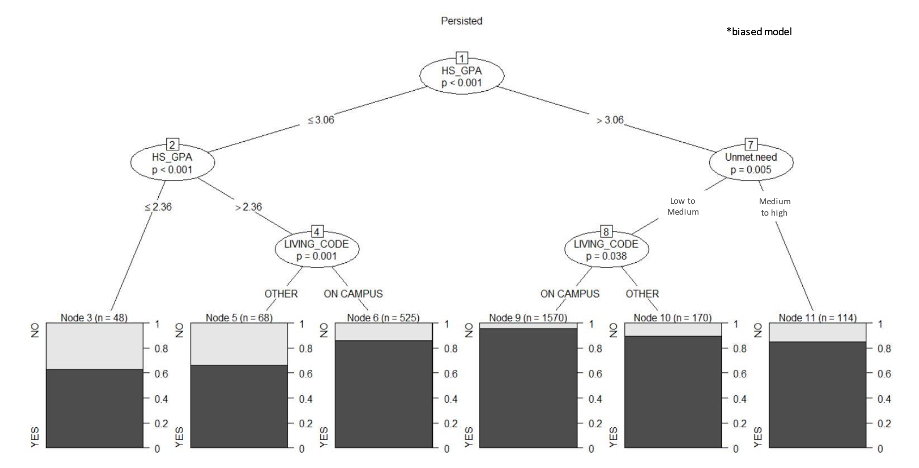
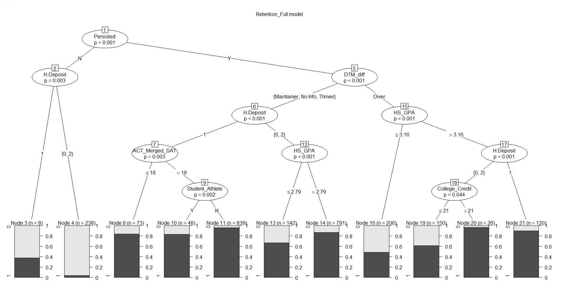
We framed the problem as a binary classification task: Would a student persist (return the following semester) or not persist (drop out or stop enrolling)?
This simple output belied the complexity underneath. The challenge was to combine behavior, academic metrics, and engagement into a format that an algorithm could learn from—and trust its patterns enough to surface high-risk students.
We prepared our dataset with one row per student per semester, and an outcome column:
1if they did not return0if they did
Everything else? Inputs for the model.
Data Preparation: Turning Student Life Into Features
Before we even touched an ML model, we spent weeks engineering our input data to reflect real student behavior.
Some raw features we collected:
- GPA and GPA trend from previous semesters
- Overall and course-specific attendance
- Number of events attended, with time deltas (early vs late semester)
- Advisor meeting frequency
- Course load and credit completion ratio
- Major changes
- Residence type (on-campus, off-campus, commuting)
- Use of academic or mental health support services
But raw values weren’t enough. We transformed them into model-ready features:
- Normalized engagement rates (
events_per_week) - Rolling averages on GPA over multiple terms
- Flag for downward GPA trajectory
- Flags for behavior anomalies (e.g., sudden stop in attendance)
- Binary and one-hot encodings for categorical fields (e.g., student type, college, major)
We made sure to impute missing values carefully—zero was often a meaningful value (e.g., no events attended), while in some cases we forward-filled data from previous semesters.
Enter Random Forest and XGBoost
Once our dataset was structured and cleaned, we experimented with different models using Scikit-Learn. Two models rose to the top in both performance and interpretability:
What is Random Forest?
A Random Forest is an ensemble learning method. It builds many individual decision trees, each trained on a random subset of the data and features, and then combines their outputs to make a final decision (like a committee voting).
Why we used it:
- It handles both numerical and categorical data well
- It’s relatively robust to missing data and outliers
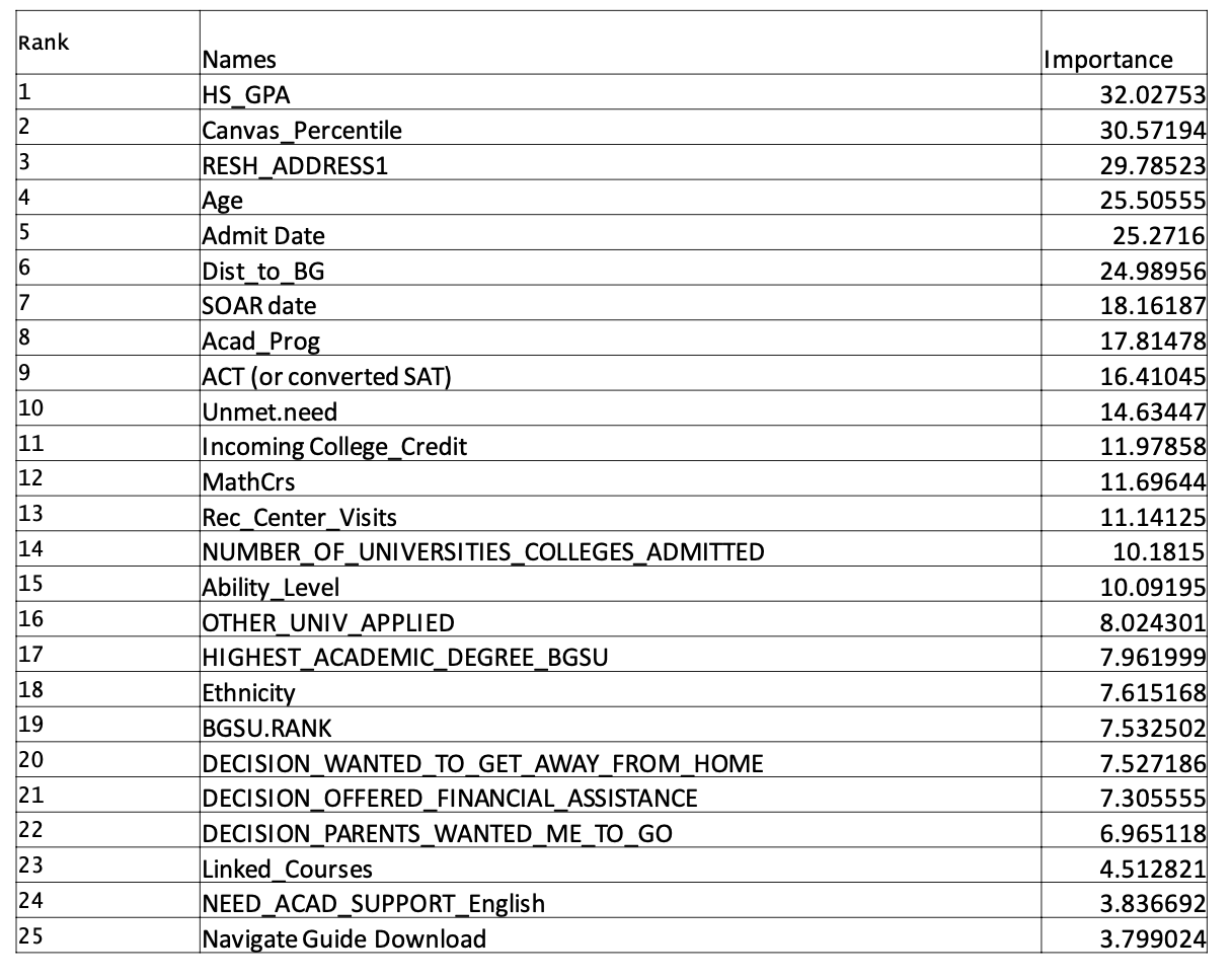
- It gives feature importance scores, which helped explain why predictions were made
from sklearn.ensemble import RandomForestClassifier
from sklearn.model_selection import train_test_split
from sklearn.metrics import classification_report, roc_auc_score

# Split dataset
X_train, X_test, y_train, y_test = train_test_split(features, target, test_size=0.2, stratify=target)

# Train model
rf_model = RandomForestClassifier(n_estimators=100, max_depth=8, class_weight='balanced', random_state=42)
rf_model.fit(X_train, y_train)

# Evaluate
y_pred = rf_model.predict(X_test)
print(classification_report(y_test, y_pred))
print("AUC Score:", roc_auc_score(y_test, rf_model.predict_proba(X_test)[:, 1]))
The class_weight='balanced' option helped compensate for the class imbalance—since far more students stayed than dropped out.
What is XGBoost?
XGBoost (Extreme Gradient Boosting) is a more advanced, highly optimized algorithm that builds models sequentially—each tree learns from the mistakes of the previous one.
Why we shifted to XGBoost:
- Better performance on imbalanced datasets
- More tunable and flexible than Random Forest
- Handles missing values natively
- Faster training and more control with regularization
import xgboost as xgb
from sklearn.metrics import roc_auc_score

# Prepare data in DMatrix format
dtrain = xgb.DMatrix(X_train, label=y_train)
dtest = xgb.DMatrix(X_test, label=y_test)

params = {
    'objective': 'binary:logistic',
    'max_depth': 6,
    'eta': 0.1,
    'eval_metric': 'auc',
    'scale_pos_weight': 4.5  # Balancing positive and negative classes
}

# Train
xgb_model = xgb.train(params, dtrain, num_boost_round=100)

# Predict
y_probs = xgb_model.predict(dtest)
print("AUC Score:", roc_auc_score(y_test, y_probs))
We adjusted scale_pos_weight based on the ratio of persisters to non-persisters, helping the model focus on rare dropout cases.
Making Sense of Model Outputs
A model is only as useful as its ability to be understood. We weren’t building this for data scientists—we were building it for academic advisors and student support teams.
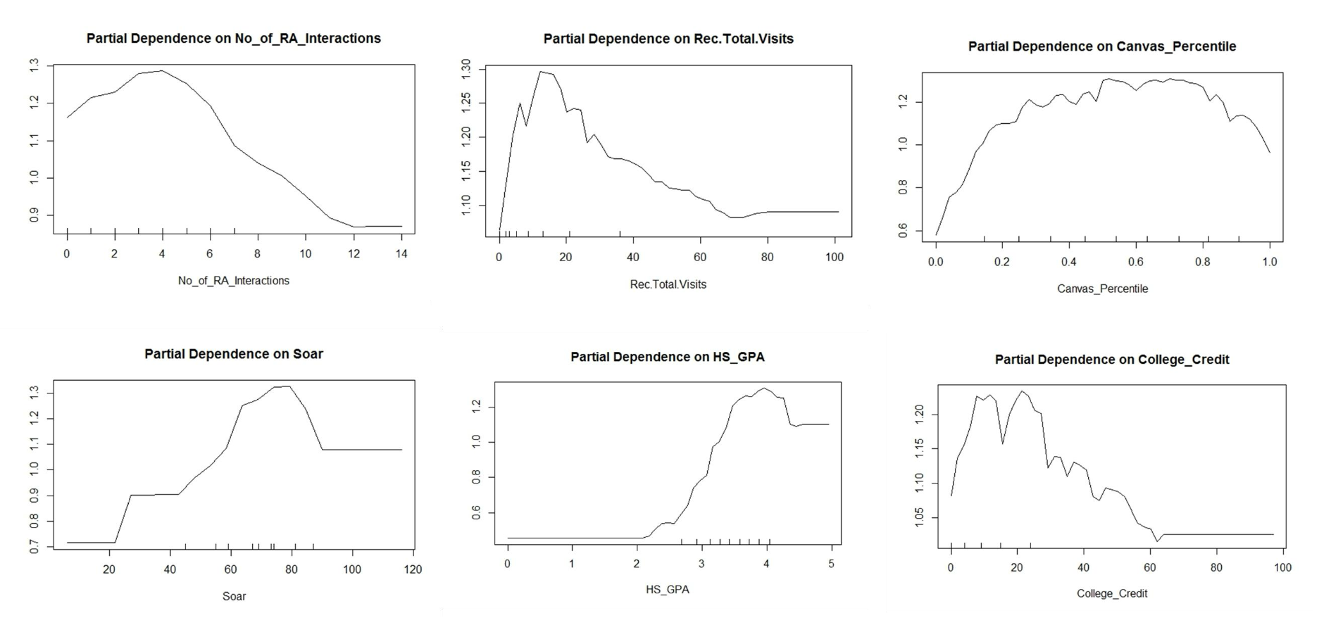
So we didn’t just stop at predictions. We used feature importance scores and SHAP values (SHapley Additive exPlanations) to understand why each prediction was made.
For example:
import shap

explainer = shap.TreeExplainer(xgb_model)
shap_values = explainer.shap_values(X_test)

# Plot feature impact
shap.summary_plot(shap_values, X_test)
This allowed us to generate reports like:
Student ID 392812
Prediction: 78% risk of not persisting
Top contributing features:
- Sharp GPA decline in last semester
- No event engagement after Week 6
- Missed 3 consecutive advising appointments
These kinds of outputs made the models actionable. Advisors didn’t just get a list of "at-risk" students—they got a story.
Evaluating the Models
To ensure we weren’t chasing misleading performance metrics, we evaluated our models using AUC, precision, and recall. Accuracy wasn’t enough—after all, if 90% of students stayed, a model could get 90% accuracy by doing nothing.
We wanted to catch the ones who might otherwise go unnoticed.
After hyperparameter tuning, our XGBoost model consistently scored:
- AUC: 0.84–0.87
- Precision: ~0.71
- Recall: ~0.65
This gave advisors a strong lead—without overwhelming them with false positives.
From Prediction to Action
The final step was integrating these predictions into our ecosystem. Each week, we ran a fresh scoring job. Students with elevated risk were tagged with their probability and top risk indicators.
These scores were then pulled into Power BI dashboards, where advisors could filter by college, major, GPA tier, and engagement levels—and drill into any individual student.
This wasn’t a machine learning project built in isolation. It was a system, designed to surface insight in the exact places where people could act on it.
What We Struggled With—and How We Solved It
This wasn’t a clean path from idea to implementation. In fact, much of our success came from learning to adapt to imperfect conditions.
One of the first—and most persistent—challenges we faced was data inconsistency. Not every department reported engagement the same way. Some had time-stamped logs of event attendance. Others only tracked participation quarterly. Advising sessions were sometimes manually recorded, sometimes not recorded at all. And across semesters, schema changes or reporting standards would shift—quietly.
To deal with this, we had to build defensive pipelines. We added schema validators, fallback logic for missing features, and fallback imputation strategies for semester gaps. More than once, we had to pause training a model because a new data batch introduced an unknown format. Eventually, we created standard templates for data exports and worked with departments to normalize reporting, but that took time—and a lot of explaining.
Another major obstacle was the skepticism we initially met from non-technical stakeholders. Many advisors and admins were understandably cautious: Would this model reduce students to numbers? Would the algorithm "judge" someone unfairly based on incomplete data?
We didn’t solve that with more metrics—we solved it with transparency.
Rather than hiding behind probabilities, we leaned hard into interpretability. We held multiple sessions where we walked through how a prediction was made for a sample student, feature by feature. Once people saw that the model was surfacing common-sense patterns—just faster, and at scale—they started to trust it. We weren’t replacing their judgment. We were giving it a head start.
There was also the constant time pressure. Academic calendars don’t wait. We had to produce usable results within semesters, not years. That meant making choices. Sometimes we used a simpler model because it could be trained, tested, and deployed within a single break week. Sometimes we sacrificed a bit of predictive power to keep the feature set explainable and stable.
What Could Have Been Better
Looking back, there are things I would have done differently if we’d had more time or a larger team.
First, we could’ve invested earlier in a robust feature store or metadata catalog. So much time was spent trying to remember which columns came from where, what had changed between semesters, and whether a renamed feature had drifted in meaning. A shared internal data dictionary—automated or manual—would’ve saved us dozens of hours.
Second, I would’ve loved to work more closely with students themselves. We built the system for them, but most of our input came from institutional records and advisor insights. Some kind of student feedback loop—either qualitative interviews or opt-in transparency into their own risk scores—might have improved our models and how they were used.
And lastly, more automated retraining pipelines. Every few months, we manually retrained the models to reflect new student cohorts and evolving patterns. With more engineering bandwidth, that could’ve been streamlined into a regular MLOps workflow.
The Provost’s Reaction: From Data to Direction
When we finally delivered the first full analysis to the Provost and senior leadership, it wasn’t a slide deck filled with technical jargon. It was a concise story: how we identified patterns, where the institution could intervene earlier, and what kind of students might benefit from proactive support.
The reaction?
"This is the kind of work that changes how we operate as a university."
The Provost saw the retention prediction model not as a finished product—but as a compass. It gave the administration new visibility into trends across programs, populations, and behaviors. It gave them confidence to invest in earlier advising, expand Life Design programming, and put more energy into first-year experience initiatives.
For the first time, we weren’t just reporting after the fact—we were enabling action before problems took root.
That’s when it really clicked: this wasn’t just about models or dashboards. It was about building systems of awareness, care, and momentum—at scale.
In Chapter 3, I’ll walk you through how we took all this predictive intelligence and wrapped it into a visual, intuitive Power BI experience—one that let BGSU’s Life Design team actually use the data, every day, to help students thrive.
In Chapter 3, I’ll show you how we turned these insights into intuitive, human-first dashboards using Power BI—and how those tools helped shift the way BGSU advisors approached student success.


